v1.0
loading
Currently building products,
learning constantly,
and looking for opportunities
to create things people enjoy using.
VARAD · PD-001 · CONTACT
VARAD SANDHAN · PRODUCT DESIGNER · 2026
Explore my other case studies
More work →
CASE STUDIES · UX DESIGN · PRODUCT THINKING · INTERACTION · RESEARCH ·
CASE STUDIES · UX DESIGN · PRODUCT THINKING · INTERACTION · RESEARCH ·
CASE STUDY 01
5 min read


Cross-Medium Companion App
Tsuzuki
WHAT THIS PROJECT ACTUALLY TAUGHT ME
Three things I wouldn't
know if this project had
gone smoothly.

Sharvil would have called me every time a product changed.
The HTML build worked. Clean, responsive, fast. But only I could update it. Six months later, when a product family was added — the site would be frozen without me.
IF I HAD SHIPPED HTML/CSS
The site would look like every other manufacturer in Maharashtra.
IF I HAD SHIPPED HTML/CSS
Three brown moodboard directions. All fine. All identical to every competitor I audited. The constraint felt real because I hadn't questioned it yet.
Every procurement manager would have left before seeing them.
Hero → Products → Stats — the credibility numbers were three sections deep. A buyer with three tabs open and 30 seconds doesn't scroll that far. They close and move on.
IF STATS HAD STAYED AT THE BOTTOM
01
03
BECAUSE I REBUILT IN WEBFLOW
The client owns the site. Not the designer.
Sharvil can add a product, update a description, change a photo — without opening a file. That's what the site was actually for.
BECAUSE THE MOODBOARD CAME FIRST
One benchmark session made the colour system obvious.
German precision firms. Japanese suppliers. None used warm tones. Slate Navy appeared in every credible reference — one session locked the whole system downstream.
BECAUSE STATS CAME SECOND
Trust lands before the buyer reaches the products.
Moving stats immediately after the hero meant every visitor — even those who bounced after one scroll — saw 13+ years, 350+ products, ISO certified.
02
Final Mockups


Why I chose Webflow
after building the site
in HTML and Framer first
The original plan was Figma to HTML/CSS handoff. I built the full homepage — it works, it's responsive. Then rebuilt it as a Framer React component. That works too. Then chose Webflow, rebuilding everything a third time.
The question I wasn't asking early enough: can Sharvil update this site in twelve months without calling me? On HTML — no. On Framer — no. On Webflow with CMS — yes.
technospace-engineers-65abb2.webflow.io
HTML / CSS
Client can't update it. Adding a product family requires editing code.
Full control
Fastest to build
Zero client autonomy
Every update = a call to the designer
Webflow + CMS
Client can add a new product by filling a form and hitting publish. No code. No call.
CMS-driven products
Client-editable
Live URL on day 1
Scales without a developer
Framer / React
Great for portfolios. Wrong for a B2B client who needs to manage their own products.
Visual editing
React components
No native CMS
Requires developer for updates

4.Why the enquiry form has a
"Drawing Available" field and a file upload instead of a message box
Final iteration
4.Why the enquiry form has a
"Drawing Available" field and a file upload instead of a message box
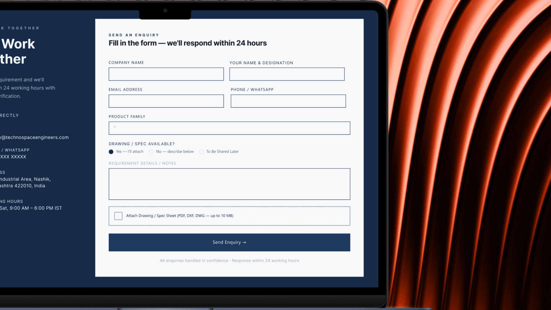

V2 added three things: a Product Family dropdown to route the enquiry, a "Drawing Available" radio so Technospace can immediately tailor the response — a DFM checklist for yes, a capability deck for no — and a file upload accepting PDF, DXF, and DWG. A procurement manager fills it in under 90 seconds. Technospace receives a routable, actionable lead instead of a vague message.
Every manufacturer website has a contact form. Name, email, message box, submit. It's the default and it's wrong for B2B manufacturing. A procurement manager evaluating a precision stamping supplier doesn't want to type a paragraph describing their requirement. They have a drawing. They have a spec sheet. They have a DXF file sitting in their downloads folder right now.
A generic message box asks the buyer to explain their requirement in words. A procurement manager has a drawing. The form should accept that drawing — not ask them to describe it.
Initial Iteration
3.Why the Stats Bar sits between the Hero and Products instead of at the bottom
Initial Iteration
Final iteration

On most manufacturer sites the credibility stats — years of experience, product count, certifications — live at the bottom of the page. The logic is: earn the visitor's interest first, then prove your credibility. That logic works for consumer products. It doesn't work for B2B procurement.
A procurement manager has three tabs open and 30 seconds to decide if you're worth a call. If your credibility signals are at the bottom of the page, they never see them — because they've already left.
Three section orderings were wireframed. Order A: Hero → Products → Stats → Facilities. Order B: Hero → Stats → Products → Facilities. Order C: Hero → Products → Facilities → Stats. Order B was validated against three competitor sites by measuring how far a visitor scrolls before hitting a trust signal. On every competitor site, trust signals were below the fold on a 1440px screen. On the Technospace redesign, they land within the first scroll — before the buyer has even reached the products.
Order B
CHOSEN ✓
Hero
↓
Stats
← trust lands here
↓
Products
↓
Facilities
Trust lands within first scroll
Order A
Hero
↓
Products
↓
Stats
↓
Facilities
Trust signals buried — 3 sections deep
Order C
Hero
↓
Products
↓
Facilities
↓
Stats
Trust signals buried — 3 sections deep
2.Why I rebranded the logo from brown
to Slate Navy


The client brief said full creative freedom. The existing logo was brown — a deep burnt sienna that reads as earthy and traditional. My instinct was to keep it and design around it.
Every direction built around the brown logo looked like a manufacturer's website. That was the problem — Technospace needed to look like the one manufacturer a procurement team trusts over all the others.
The color that recurred across every credible reference was a slate navy. Not corporate blue, but a blue with enough grey to read as precision rather than personality. That single decision — #1E3A5F as the brand anchor — locked the entire system downstream: surface, card, text hierarchy, border treatment, everything.


The standard direction for a manufacturer's hero is either a full-bleed factory photo with a headline overlay, or a centered split with a product shot. Every competitor site I audited — Tata Precision, Minda Industries, smaller Nashik-area vendors — followed one of those two patterns. They all looked identical. More importantly, they all made the visitor do the same thing: scroll down to find out what the company actually supplies.

The wireframe exploration produced five hero variations. V1 was a standard centered layout. V2 was full-bleed photo. V3 introduced a right-side panel but with a single featured product. V4 expanded that panel into a full product directory with all six families listed. V5 tested a tabbed version of the directory. V4 became the final direction — scannable, specific, and one click away from the product the buyer actually wants.

Decisions that
defined the redesign
1. Why I replaced the full-bleed hero with a split layout that puts the product directory on the right side of the fold
The buyer's first question is not "who are you" — it is "do you make what I need." If that answer isn't visible in five seconds, they go back to the search results.
Technospace's old site opens with a centered logo, a vague tagline, and a photo of a factory floor. The first thing a procurement manager sees tells them nothing about what they can actually buy.

The existing website contained valuable manufacturing information but failed to communicate trust, capability, and credibility to modern B2B buyers.

No CTA above the fold — or anywhere
The homepage has no button, no phone number, no enquiry link visible without scrolling. A procurement manager who needs to contact you can't.
No credibility signals a B2B buyer trusts
No ISO badge, no capacity numbers, no client sectors. The site doesn't answer: can this company handle my volumes? Are they certified? Have they worked with OEMs?
Generic factory photo, zero specificity
The hero shows a factory floor. So does every competitor. There's no indication of what Technospace specifically makes — no product categories, no capability signals.
Product cards themselves "No specs, no SKU count, no industries. Cards are decoration, not information."
The Real Problem
The existing website contained valuable manufacturing information but failed to communicate trust, capability, and credibility to modern B2B buyers.

Design Brief
Redesigning the digital presence of a precision sheet metal manufacturing company to improve credibility, showcase manufacturing capabilities, and help procurement teams quickly evaluate products and facilities.
Project
Technospace Engineers — freelance
Timeline
May 2026 – June 2026
Role
Product Designer
Responsible for research, conceptualisation, design, wireframe testing and delivery of all flows.
Team
01. Product Designer (solo)

Technospace
Modernizing an Industrial Manufacturer's Digital Presence