Explore my other case studies
More work →
CASE STUDIES · UX DESIGN · PRODUCT THINKING · INTERACTION · RESEARCH ·
CASE STUDIES · UX DESIGN · PRODUCT THINKING · INTERACTION · RESEARCH ·


Reflection on the project.
The hero feature came from research, not a screen.
The Sync Map emerged from the journey map — Ryo’s seven-step ritual was visible in the data before any wireframe. Research wasn’t support for the design. Research was the design.
Defaults are a value system.
Spoiler Guard defaulting ON was the highest-impact decision in the product. Most users never opened Settings — the default became the experience. A default is the product’s values expressed as behaviour.
Expert evaluation sharpens user testing.
The heuristic evaluation predicted exactly what the two sessions confirmed. Knowing where to look first made the limited testing time focused and the findings sharp.
Now you can finish the story
without anyone ruining it.
Happy-path design is table stakes. The three edge states that reveal product character: a series with no sync data yet, a first-run empty library, and returning after a 14-month drop.
21 screens. One principle:
get out of the way so the
fan can get back to the story


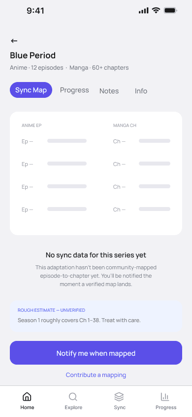

Happy-path design is table stakes. The three edge states that reveal product character: a series with no sync data yet, a first-run empty library, and returning after a 14-month drop.
Edge Cases
Tsuzuki designed for them.
The standard re-entry pattern is: show last position, show a CTA to continue. Every streaming app does it. The problem for Tsuzuki’s context: a user who dropped Vinland Saga 14 months ago doesn’t just need to know their position — they’ve forgotten the story. Tapping ‘Continue from Episode 18’ without context means opening the episode feeling lost, then dropping it again.
Re-entry leads with a recap, not a button
30 sec
TO TURN GUARD OFF —
DELIBERATE, NOT ACCIDENTAL


Every tracker app defaults to showing all content. MAL, AniList, Kurozora — all open. The logic is user agency. The problem is that the catastrophic failure mode — seeing a future episode title, or a chapter number that reveals a character survives — is irreversible. A spoiler cannot be un-seen.
Spoiler Guard defaults ON, not OFF
2 taps
TO TURN GUARD OFF —
DELIBERATE, NOT ACCIDENTAL
The cost of the wrong default is asymmetric. OFF costs the user one tap. ON prevents permanent damage. Tsuzuki’s core user is mid-story, across two mediums — they are by definition in the most fragile spoiler position of any media consumer.


Tables are the fastest lookup format humans have. The eye finds a row, reads across, done. No scroll direction to decide. No swipe cadence to learn.
The obvious UI for episode-to-chapter is a timeline — horizontal scroll, episodes on top, chapters below. I wireframed it first. It looked editorial and it told the user nothing useful at speed. The user comes to this screen with one specific episode in mind and needs one specific chapter. That is a lookup, not a journey.
The Sync Map is a table, not a timeline
3 sec
LOOKUP TIME EP → CH
ONCE THE TABLE IS FOUND
Each story: the situation that forced it, the insight that changed direction, the evidence that confirmed it.
Design Decisions.
Every one tested against
alternatives — not taste.


I explored every core flow as rapid AI-assisted wireframe variations — generating breadth was cheap. Judging them against the one question (can the fan find the right chapter without fear?) was the design work. Rejected versions stay visible.
Raw thinking, shown raw.

Splash
first launch
Home
Search
History
Profile
recommended + continue
find any series
everything logged
stats + settings
Series Detail
Add Series
Re-entry
the hub
format + Guard setup
resume dropped series
Sync Map
Progress
About
Read
ep ↔ ch
both mediums
series info
legal options
Added ✓
confirmation
Log Episode
update position
Read Chapter
legal reader handoff
Derived from the working prototype. A shallow tree built around one job: get from ‘I just watched an episode’ to ‘I know exactly what to read next’ — safely.
Information Architecture
Every competitor treats cross-medium sync as the fan’s problem to solve.
Tsuzuki is the only one that treats it as the product.
✓
✓
✓
✓
✓
✓
Tsuzuki
MyAnimeList
AniList
Kurozora
Filler List
Track a single medium
✓
✓
✓
✕
Episode ↔ chapter sync map
✕
✕
✕
✕
Spoiler boundary by position
✕
✕
✕
✕
Filler markers inline
✕
✕
✕
✓
Spoiler-safe re-entry
✕
✕
✕
✕
One unified progress view
✕
✕
✕
✕
I mapped every tool a fan currently uses against the five capabilities that the anime-and-manga overlap actually demands.
Nobody is competing for the
cross-medium fan.
Sync Map
An episode-to-chapter table on every series page. Finish Episode 87, see exactly which chapter continues the story. No Google, no Reddit.
Spoiler Guard
A boundary based on the user’s current position. Rows beyond where they are stay locked. Defaults ON — the failure mode is permanent.
Spoiler-safe re-entry
A recap covering only what they’ve seen, plus ‘what changed while you were away’. Re-onboards the fan into the story in under a minute.
Fans finish a season and immediately Google the chapter — the app they’re already in offers no bridge to the manga.
Every fan had a spoiler horror story. A spoiler isn’t an inconvenience — it’s the theft of an irreversible experience.
Returning to a dropped series takes longer than the episode itself — fans reconstruct their progress from memory.
User research & findings
1. After an anime season ends, how do you decide where to start in the manga?
2. Have you ever been spoiled by starting at the wrong chapter? What happened?
3. How many tools do you open in a single session before watching or reading?
4. How do you handle filler episodes?
5. When you drop a series and come back months later, how do you find your place?
6. Do you keep any kind of personal log? Where?
7. What would make you trust an app to tell you the right chapter?
8. What do existing trackers (MAL, AniList) get wrong for you?
I interviewed fans who follow both mediums and mapped their behaviour through empathy maps and journey mapping. The questions focused on the moment of switching from anime to manga:
What I asked anime & manga fans.
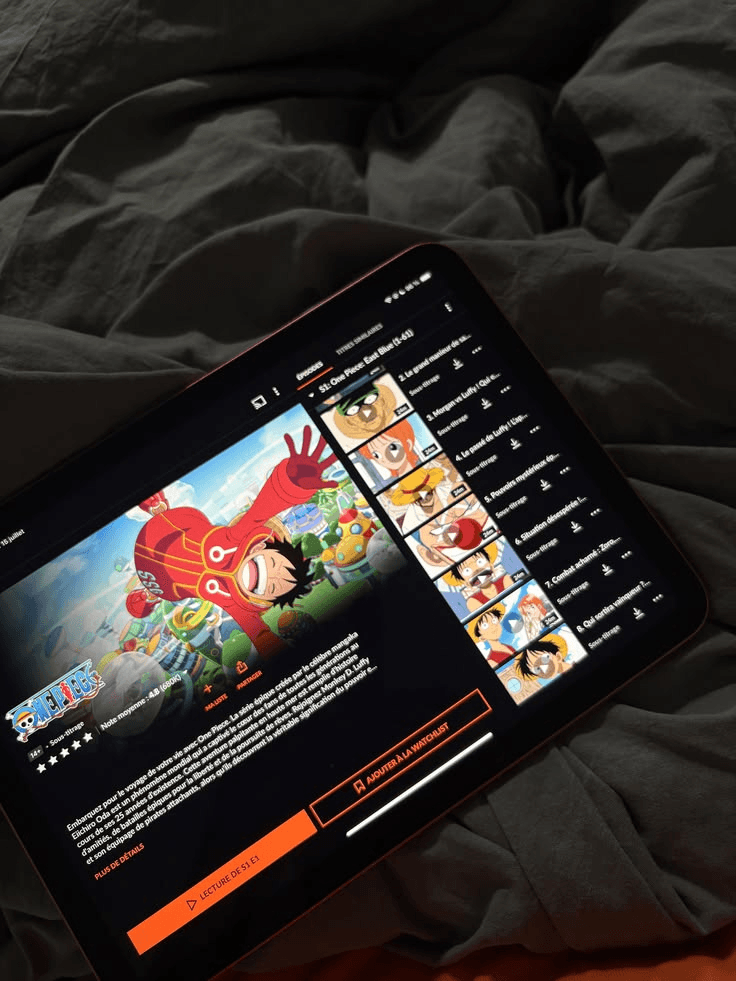

I lived inside the problem for a month.
Instead of starting from assumptions, I watched anime for a month with the manga open beside me — logging every divergence point, every Google search, every near-spoiler. Then I mapped what I found against five fan archetypes through empathy maps and journey mapping.
The pattern was consistent: the bottleneck was never the content. It was the gap between the two mediums, and the fear of crossing it wrong.
With Tsuzuki:
1 tap.
Open the series. The Sync Map already knows the chapter.
CRUNCHYROLL
01
▶
Finish the episode
MANUAL STEP
02
⌕
“what chapter after ep 87”
MANUAL STEP
03
◉
Read 3 conflicting answers
UNCERTAIN
FANDOM WIKI
04
ⓘ
Cross-check the arc
MANUAL STEP
FILLER LIST
05
≡
Check which eps were filler
MANUAL STEP
06
◉
Scroll past a spoiler reply
SPOILER RISK
MANGA APP
07
▤
Guess the chapter, open it
UNCERTAIN
—
08
✕
Wrong chapter. Spoiled.
SPOILER RISK
THE RITUAL, BEFORE TSUZUKI
8 steps. 4 tools. Every single time.
I follow a lot of series in both mediums. Every time an anime season ends and I want to keep going in the manga, the same ritual begins: Google the chapter, cross-check Reddit, open a wiki, dodge the spoilers in the replies. Eight steps, four tools, and one in four times I land on the wrong chapter and ruin the thing I love. I kept wondering — why isn’t this just one screen?
Watching anime is great.
Switching to the manga is where it falls apart.
To understand the
problem, you have to feel it first.
r/anime · thread: just finished S2, what chapter next?
“Oh you’re at episode 87? Yeah that’s right before
███████ dies and █████ betrays everyone”
↑ you read it before you could look away. that’s the problem.
A spoiler isn’t a minor inconvenience.
It’s the theft of an experience you can never get back.
1 in 4
SWITCHING SESSIONS
ENDS IN A SPOILER
8 steps
ACROSS 4 TOOLS,
EVERY SINGLE TIME
r/anime · thread: just finished S2, what chapter next?


Design Brief
In 2026 I designed Tsuzuki — a cross-medium companion app for fans who follow the same series in both anime and manga. The product solves a problem no existing tracker addresses: knowing exactly which manga chapter to continue from after an anime episode, without getting spoiled. Built end-to-end: research across five personas, IA, wireframe iterations, a two-colour design system, and high-fidelity UI for 21 screens, fully prototyped.
Project
Tsuzuki — self-initiated concept
Timeline
2025 – 2026
Role
Product Designer
Research, IA, wireframing, design system, hi-fi UI, prototyping, usability testing.
Team
01 Product Designer (solo)
Tsuzuki
Helping anime and manga fans switch between
both mediums without spoilers or guesswork.


v1.0
loading
Currently building products,
learning constantly,
and looking for opportunities
to create things people enjoy using.
VARAD · PD-001 · CONTACT
VARAD SANDHAN · PRODUCT DESIGNER · 2026