v1.0
loading
Currently building products,
learning constantly,
and looking for opportunities
to create things people enjoy using.
VARAD · PD-001 · CONTACT
VARAD SANDHAN · PRODUCT DESIGNER · 2026
Three things I wouldn’t know if I had trusted my first instinct.
01
Variations are cheap.
Opinions are expensive.
Every core screen got three tested layouts. Almost every time, the aesthetic favourite lost on evidence — spacious layouts, card grids, boxed stats. The comparison turned preference into proof.
R-01 — Every layout decision traces to a documented test, not a personal taste.
02
Whitespace is not
a virtue. It’s a budget.
Under a ten-second constraint, breathing room that forces scrolling actively costs the user. The dense Explore list beating the beautiful card layout made this undeniable.
R-02 — Density became a tool: dense where users compare, spacious where they confirm.
03
The strongest decision was
refusing to design a screen.
Smart Nudge came from the journey map, not screen exploration. The product’s highest-value moment lived outside the app. No UI iteration would have found it.
R-03 — Research artifacts stopped being deliverables and became decision tools.
See you at the canteen :)

One principle:
decide before you move.
The scenarios most apps ignore.
UniEats designed for them.
Happy-path design is table stakes. The moments that reveal product quality are the ones most tools leave blank — a failed payment, a full canteen, a cancelled order. These are the three UniEats had to get right.


Payment failed — order preserved, no duplicate.
Order cancellation — 2-minute window, then it locks.
The most common failure mode is the worst kind of UX: the user doesn’t know if money left their account or if the order went through. UniEats resolves this in three lines — the order is preserved, no charge was created, and a single button retries. If money was deducted, a refund message appears automatically. No support ticket needed.
A 2-minute cancellation window opens immediately after payment confirms. After the canteen accepts the order, the window closes — not as punishment, but because a prepared meal is a real cost. The window is surfaced proactively in the pickup status screen, not buried in settings. Cancelling inside the window restores the full amount instantly.
Edge cases are not exceptions — they’re the product’s character revealed under pressure. Every one of these was designed before the first hi-fi screen was built.
A food app with no food colors
Every competitor uses appetite colors — red, orange, warm gradients. UniEats users are already hungry; the app’s job is speed. Charcoal mutes everything that isn’t information. Lime appears only on the thing to tap or the thing the engine chose — never decoration.
Charcoal
#1C1C1E
Lime
#A3E635
Charcoal & Lime — a two-colour system built for speed, not appetite.
UNIEATS DESIGN SYSTEM · COLOUR & TYPE · 2026
Charcoal
#1C1C1E
Background bands & dark surfaces
Lime
#A3E635
Primary CTA, top-ranked pick only
Lime Tint
#F0FDF4
Callout backgrounds, badge fills
Status Green
#2D9E5F
Confirmed, ready, low crowd
Grey 600
#6B7280
Body text, secondary labels
Grey 100
#F3F4F6
Card backgrounds, dividers
White
#FFFFFF
Page background, card surface
From tap to tray, no counter chaos
Cart confirms in one screen, payment is two taps, and pickup status tells the student exactly when to walk — ‘Ready in 5 mins, Counter 2’. The order number replaces the queue.




The default food-app pattern is a browsing grid — categories, banners, infinite choice. It works when the user has time. UniEats users have 10–15 minutes and one job: eat before the next class. Browsing isn’t freedom in that moment. It’s friction.
GLANCE → SEE #1 → TAP.
THE FULL DECISION PATH
The home screen gives an answer, not options
Every student already knows all six canteens. The problem was never finding food — it was deciding under pressure. So the home screen presents an answer.
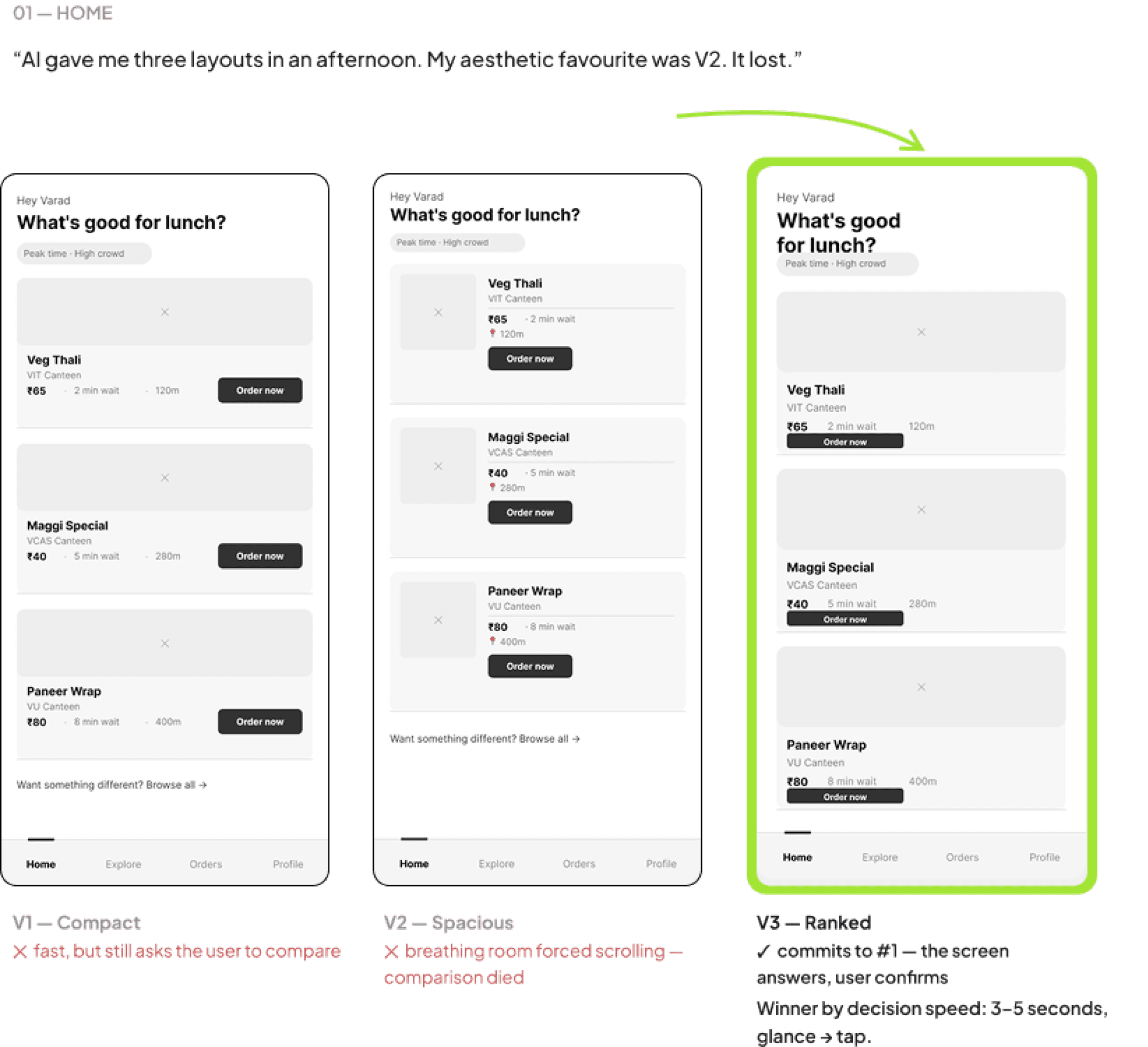
Three layouts tested. Compact comparison cards were fast but still asked the user to compare. The expanded layout added breathing room — and scrolling that broke comparison entirely.
The ranked layout committed visually to #1: white text for the top pick, grey for the rest, an “Order Top Pick” CTA. The ranking’s inputs — wait, crowd, distance — sit right under the pick, because a recommendation without a reason is just an ad.
Design Decisions
Decide before you stand up
Ten minutes before class ends, UniEats sends a lock screen nudge with the single best pick — dish, canteen, wait time, price — built from the timetable gap and live canteen load.
One glance, one tap, and the order is placed before anyone has left their seat. The highest-value moment of the product happens outside the app.


Every flow was explored as rapid AI-assisted variations — generating breadth was cheap. Judging them against decision speed was the design work. Rejected versions stay visible: the reasons they lost are the reasons the winner works.
Raw thinking, shown raw.


Linear by design — every branch removed is a decision the user doesn’t have to make.
Information Architecture
Smart Nudge
lock screen · −10 min
Direct app open
cold start
Home — Ranked
answer, not options
ONE-TAP ORDER
FALLBACK / DISMISS
NUDGE ONE-TAP → SKIPS STRAIGHT TO PAYMENT
Orders
history + active
prefs · timetable
TAB BAR
Item Detail
inline stats · no boxes
TOP PICK
Cart / Review
ETA before paying
Payment
CTA CARRIES PRICE
Payment failed
order preserved · retry
Canteen closed
alert + alternative
Pickup Status
‘Ready in 5 — Counter 2’
Canteen Detail
menu · live load
Explore
7-row dense list
Every competitor treats cross-medium sync as the fan’s problem to solve.
Tsuzuki is the only one that treats it as the product.
Swiggy /
Zomato
group orders
Campus apps
abroad
numbering
Tsuzuki
Order ahead, skip the queue
✓
✓
✓
✕
✓
Live wait + crowd data
✕
✕
✕
✕
✓
Built for the 10-min lecture gap
✕
✕
✕
✕
✓
Entry point before the app opens
✕
✕
✕
✓
✓
Zero fees at 200 metres
✕
✕
✕
✕
✓
I mapped every way a VIT student can currently get lunch against the five capabilities the context actually demands.
Nobody is competing for the decision.
The 8 questions that shaped the survey
01
How much time do you usually have between lectures for lunch?
02
How do you decide which canteen to go to?
03
How often do you reach a canteen and change your mind because of the queue?
04
Have you ever skipped lunch because the queue was too long?
05
What information do you wish you had before walking to a canteen?
06
08
Do you ever order via WhatsApp groups? What goes wrong?
07
At what moment do you start thinking about lunch?
Would you trust an app that picks the canteen for you? What would it need to show?
→ The three findings these produced — and the features they caused — follow below.
In their words
“By the time I reach, the line’s already a movie. I just join whichever looks shortest and hope.”
ARJUN, 2ND Computer Science
decides while walking
“I’ve walked to three canteens in one break. Ate nothing. Attended the 2 PM lecture hungry.”
SHARVIL, 3RD YR ENTC
the blind-bet problem
“If an app just told me where to go, I’d trust it — but only if it shows me why.”
SHREYAS, 2ND YR CIVIL
trust needs reasoning
9
/
/
/
12
12
12
changed canteens mid-walk after seeing the queue — the walk itself was the cost of having no data
7
skip lunch at least once a month because the queue ate the entire break
12
already knew every canteen by heart — discovery is a problem nobody has
Understanding how, when and why
students decide where to eat.
12 students interviewed across departments · 1 week shadowing the 1 PM rush · 8-question survey, qualitative + quantitative.


Field observation
Instead of relying on interviews alone, I spent a week ordering lunch the way everyone does — joining the 1 PM rush, timing queues, and watching the WhatsApp group-order chats fill up.
The pattern was consistent: the students who ate fastest weren’t the ones who walked fastest. They were the ones who had already decided — before leaving the classroom. The bottleneck was never the food. It was the decision.

What’s so hard about campus lunch?
I interviewed students across departments and shadowed the 1 PM rush for a week. The same three problems kept surfacing:
Time
Anxiety
The 10-minute window between lectures creates real stress. Students physically run between canteens when they misjudge a queue — and sometimes skip lunch entirely.
Zero
Visibility
There’s no way to know wait time, crowd level, or what’s still available without walking there. Every choice is a blind bet paid for in break time.
Decision
Fatigue
Choosing under pressure with no information defaults to habit. Everyone picks ‘the usual’ — which is why every queue is long at the same canteens.
Lunch break is pretty great.
But the queue eats half of it.
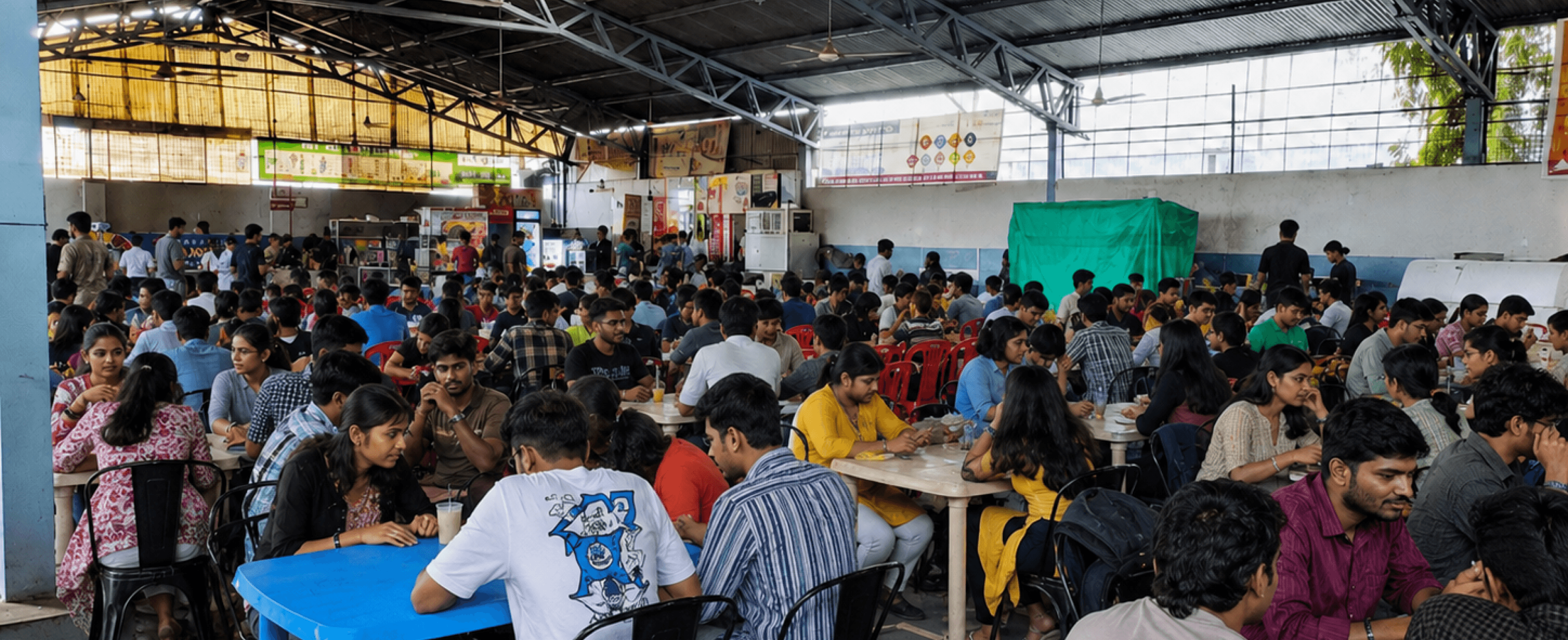
Between lectures, 4,000 students share six canteens and a 50-minute window. Deciding where to eat, walking there, and queueing takes longer than eating. I came to wonder — what if the decision happened before anyone stood up?
01 — PROBLEM
50 minutes. Four thousand students.
Six canteens. Zero visibility.
Students don’t have a food problem.
They have a ten-minute window problem.
12:50
Lecture ends.
No decision made.
1:00
Walks to canteen.
Queue: 25 deep.
1:02
Every canteen:
15–25 min wait.
1:25
Food in hand.
15 min to eat.
1:40
Next lecture.
25 MIN LOST
Every food app optimises the order.
Nobody has optimised the decision.
Design Brief
In mid-2026, I designed UniEats — a concept ordering app for the six canteens at VIT Pune, where 4,000 students share a 50-minute lunch window. The product moves the ordering decision out of the queue and into the ten minutes before class ends. Built end-to-end: research, UX architecture, wireframe testing with three variations per core screen, a two-colour design system, and high-fidelity UI for all eight flows.
Project
UniEats — self-initiated concept
Timeline
April 2026 – June 2026
Role
Product Designer
Responsible for research, conceptualisation, design, wireframe testing and delivery of all flows.
Team
01. Product Designer (solo)


UniEats
Turning a 25-minute campus queue into
a 10-second decision with UniEats.
Explore my other case studies
More work →
CASE STUDIES · UX DESIGN · PRODUCT THINKING · INTERACTION · RESEARCH ·
CASE STUDIES · UX DESIGN · PRODUCT THINKING · INTERACTION · RESEARCH ·

